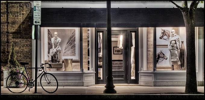
I added three limited editions to the shop. SeenBy has started selling in the US, so I added the US pricing as well. When clicking on one of the listed images you will either end up on the US version or one of the European counterparts of SeenBy. This depends on from which country you are accessing the side. Could it be any more convenient? :-)
New items in Seen.by -shop
Following a request from a potential buyer, a limited number of prints of "Hamburg Speicherstadt" can now be bought on Seen.by starting at €47 as a mini-format, all the way up to 120x71cm (48x28.4 inches) with a plex finish for a price that I don't dare to speak out.
"Princeton Nassau Street" happens to be my highest rated picture on Seen.by right now, and is now also available as mini for 36 Euros.
New Design
As I mentioned earlier, I want this page pop a little more, and also show visitors highlights that are for sale no matter through which page they enter this website. I can easily analyze the effect of those changes by checking the so called "bounce rate" in Google-Analytics. So this is probably the last change of a progressive re-design, at least for the blog section. The shop and the gallery still look like before, but will be changed after this template proofs OK. As usual, your input is appreciated.
About the template. The original template is a music theme called Gramophonica, and can be found here. My picture in the header was originally taken by Elia Mariani (greetings to Italy!) on a beautiful evening in Brooklyn. I think that was in 2005.
So! Now you know everything about it.
Oh! And my 5D Mark II finally arrived. I ordered it together with a fantastic fisheye lens, but that's another story.
More Template Talk
Okay, I calmed down a little and went from giant-size to large. Some fine tuning on the fonts and experiments with text formatting in order to have it look somewhat appealing even in this large content width. This should be a good compromise for now, until I find the perfect template.
By the way, what are your thoughts on sidebars? This current template doesn't have it and I always thought it looks more clean, lean, and mean...or in other words: elegant. But here is the catch:
A visitor who comes here through let's say Google usually ends up on one particular post. He might read it, maybe not, and surf on to somewhere else. He is not seeing any more relevant information for himself and bounces off my page. He bounces off not only because of the crap I'm writing, but also because of the lean design. There is nothing more to see that could catch his interest and make him click deeper into the page. I think it would be good to show a decent selection of images on the side and link them with the shop section.
Besides that, I should probably also add a personal profile to give this page a face.
Is Bigger Better?
I made everything a bit bigger. Does that make sense?
The main reason is to have larger images right here in the blog. So I also scaled the last two color images up. It was just as I feared:
When you upload an image into blogger and later on scale the thumbnail up, no matter if in the HTML code or with the mouse in the preview, blogger uses the little thumbnail it created as a base for that. Which means that the up-scaled thumbnail looks terrible.
A solution is to upload the large picture somewhere else (e.g. flickr), and use its web location (or URL) in the blogger-post HTML when specifying the thumbnail. Now you can scale it much better, since it uses this larger image, which obviously has more information in it.
My dear blogger.com team, this is way too much overhead. From what I heard, if you use Wordpress, you can actually upload images to flickr including image description, and have that automatically show up as a post in your blog.
As you can also see, I'm playing with the fonts right now. Please pardon the appearance!
Thumbnail Sizes on Blogger
Either I'm not getting it, or Blogger actually sucks for photo blogs. If it really sucks, then I suck too, because I haven't noticed it till now.
So here is the question: Is there a way to have larger image thumbnails using Blogger, or do I really have to switch to Wordpress for that? Are there Blogger templates that allow larger thumbnails?
The last two images were almost square, which means that they take advantage of the maximum thumbnails width as well as the maximum height. I like how they are taking a larger area, and I think it makes sense.
So any thoughts about thumbnail sizes in Blogger? Share your knowledge! Share it here! Share it now!

