Terra Monochromia 4 - and lots of changes

Lots of changes coming up!

In 2011 a lot of my energy will probably go into the experiment of becoming a pro traveler/photographer, or starving artist - however you wanna put it. Right now I'm in the middle of completely redoing this website and I'm excited about this. So here is a little heads-up. There is not really much to show you yet, but this is what I think it is going to be:

Switch to Wordpress
Migrating from Blogger to self-hosted Wordpress will give me lots of freedom to do new things. I'm also changing my webhost.

.com URL
A .com URL in addition to my German .de one.

Option to switch to German language
I'm not sure yet till what degree this will be feasible, but I will put more thoughts into it.

New design
A new elegant design that will hopefully please your eye.

Order almost any image as print
From my new blog, you will be able to buy high quality prints immediately after I posted a new image.

Well organized portfolios to browse
Re-organization of my portfolio..again with the option for you to buy my work.

Make buyers donate to good causes by buying my work
I'm looking for good causes matching the categories in the portfolio. For example, a certain amount would be donated to a New York related charity when you buy a fine-art print of New York City, etc.

More Facebook integration?
How do you feel about connecting the commenting function with Facebook? This way you would have the option to use your "Facebook identity" for posting comments.

Videographer wanted!

I'm looking for a skilled videographer who would be interested in creating a video/slide-show for a group of HDR photographers. The video will have little movie components introducing each photographer. Each one will also have an own high resolution slideshow-part with music. The job would be to put all this together and mix the music nicely.
Even though there is no pay for anybody, I think this is an exciting opportunity for a videographer to get lots of exposure. The video is going to show the work of some of the best known HDR photographers out there.

Sounds interesting? You can reach me on
Facebook
Twitter
or shoot me an email
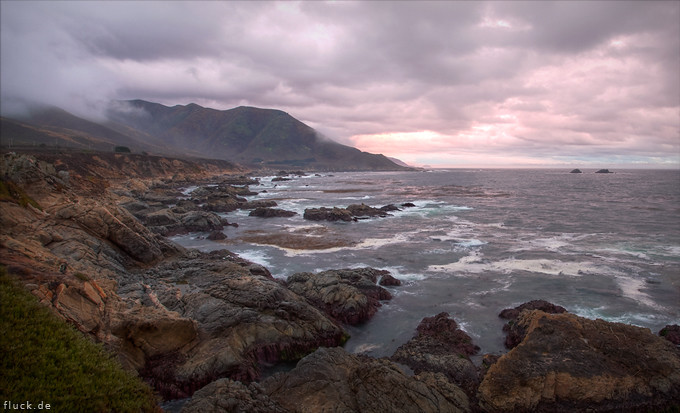
The Northern Californian Coast


Made it to San Francisco last weekend and took this picture on the way back to San Diego. The coast in the northern part of California is much more dramatic compared to the southern one. I wish I could spend more time there and in San Francisco as well. This city seems to never lose its charm even when it's raining like it did yesterday. More pictures will follow.
Oh, one note about the pink looking sky in this picture. This is not due to my bad taste, it in fact looked like this.

Another note: When you click on an image you will from now on see the image with a width of 1400 instead of 1000 pixels. Once I find the time to edit the design template, I will also increase the thumbnail image size to a width of 900 instead of 680 pixels. I believe this is appreciated, let me know if not. Once I start tinkering on the layout like this, it's usually just a question of time until I do a complete makeover by switching to a new design.

Creating Something

The joy of being creative and outputting something. That's what this page is all about - it's my personal creative outlet.

I want to let you know that if you are creative and would like to use something from my website for your non commercial project, you can feel free to take it. My only request is that you link to this website as your source. I also added a little disclaimer to the top of the page.

Flattr

OK, starting today I'm trying Flattr. Flattr seems to be the latest and greatest internet idea. I only know about it since yesterday when Kamih sent me an invite (check out Kamih's music!). On the top of this blog I have this button now that looks like this:


If you happen to have a Flattr account already, you know what it's all about. You can do something for your good karma and leave something in the tip jar. If not, you might wanna watch this little video that explains it all:

Under Construction

Hey there, I decided to update the template of this page in order to get more features working. My previous template was a bit restrictive and as I try to minimize code wrangling after my workday, I simply decided to shop around for another template that I can use as is. Of course it is not exactly how I want it and will change a few things - for example I really dislike the headline fonts, what do you think? Don't hold back if you have suggestions for design and features.

Remaining things to do:

- Get rid of flash headlines
- Reformat text area
- Fix 'Recent Comments' field
- Start to label old posts
- Set links